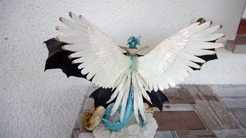
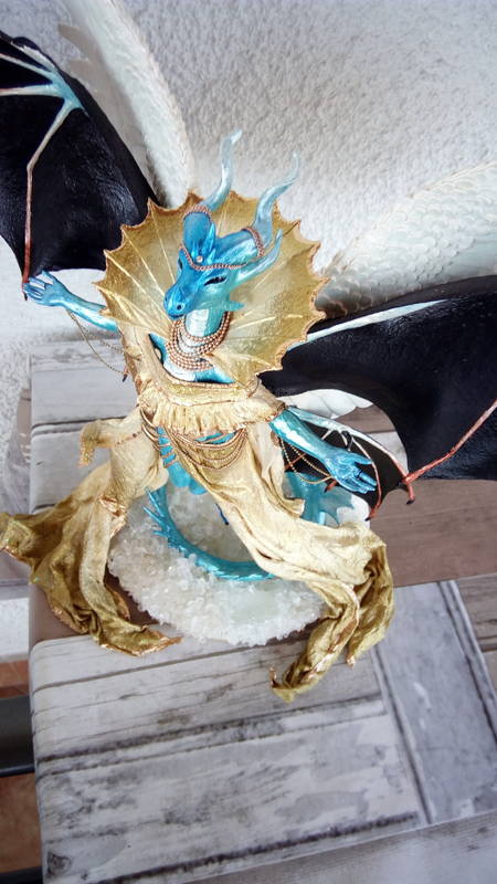
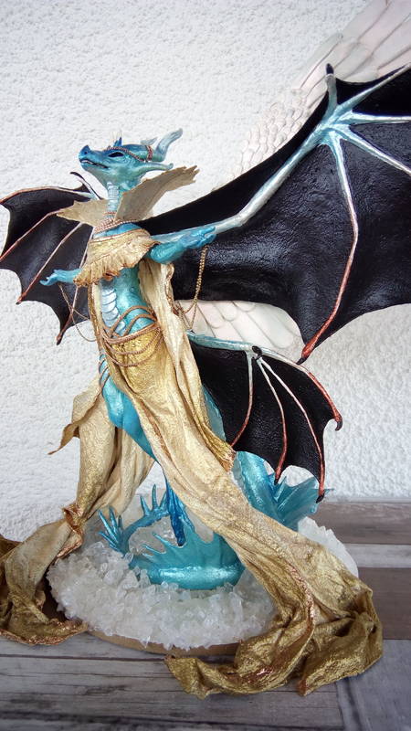
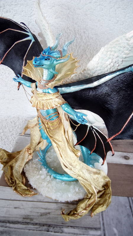
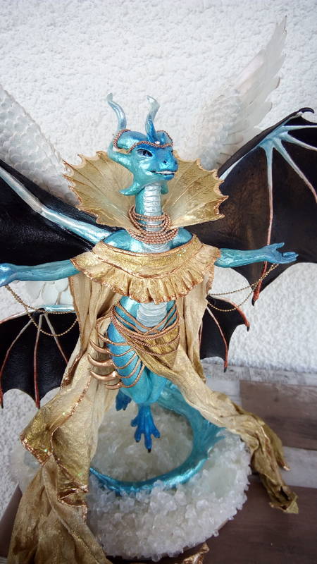
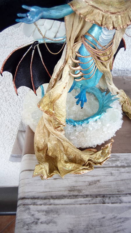
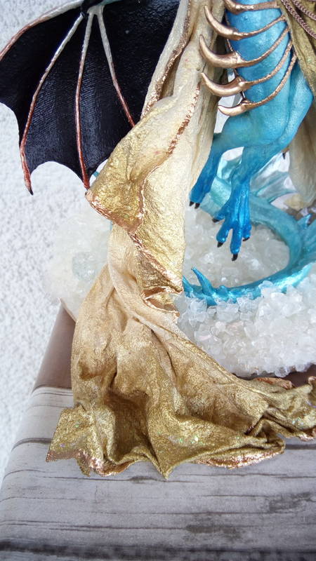
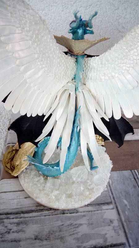
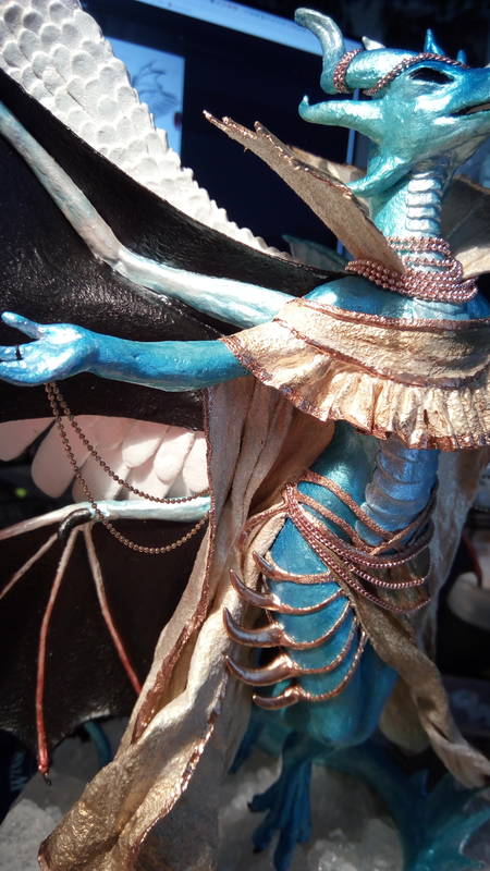
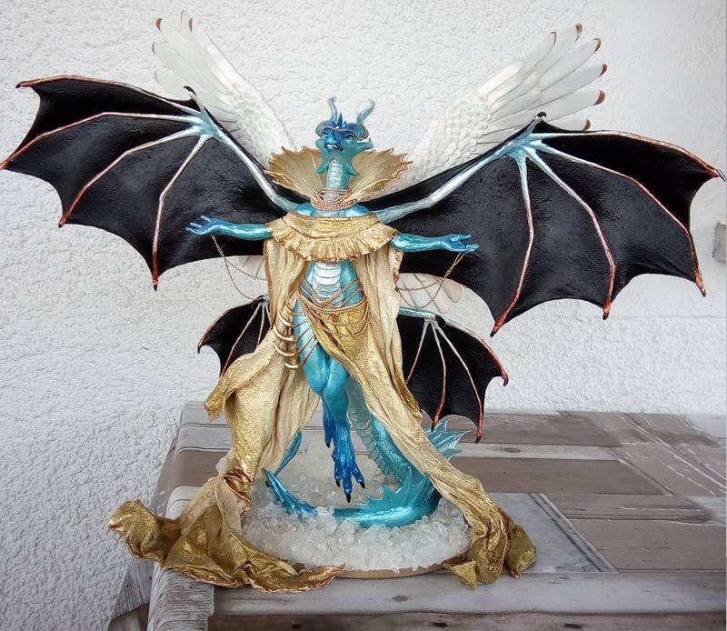
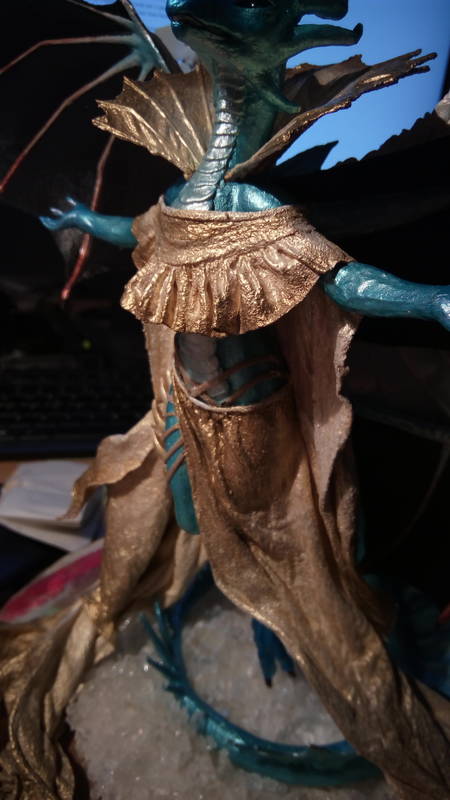
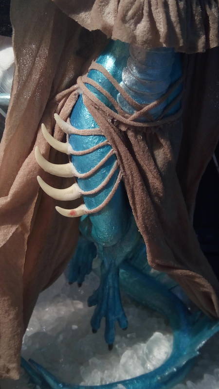
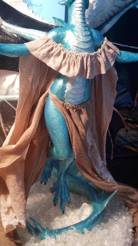
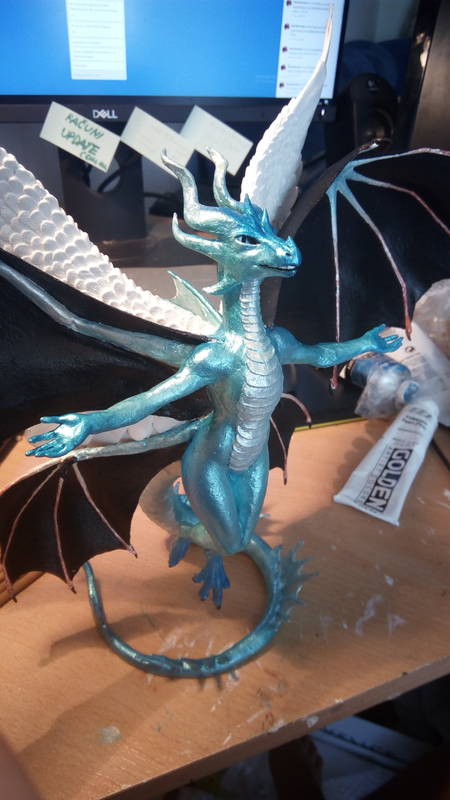
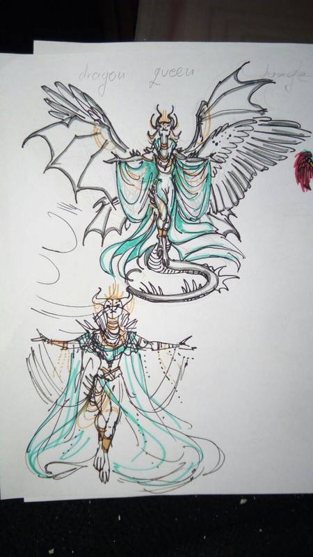
royal dragoness
Tags: dragon female magical mythical ef25 eurofurence
Public Comments
Finished! Click to see the result!
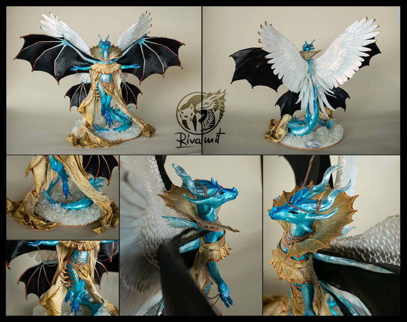
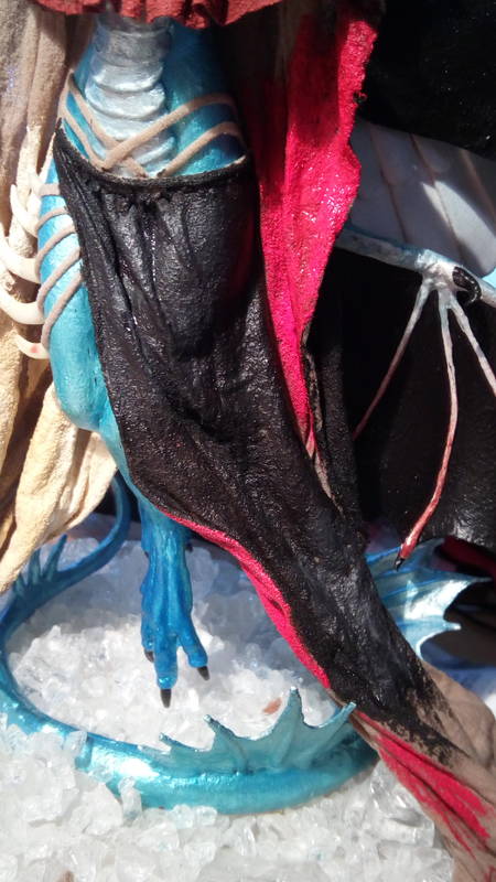
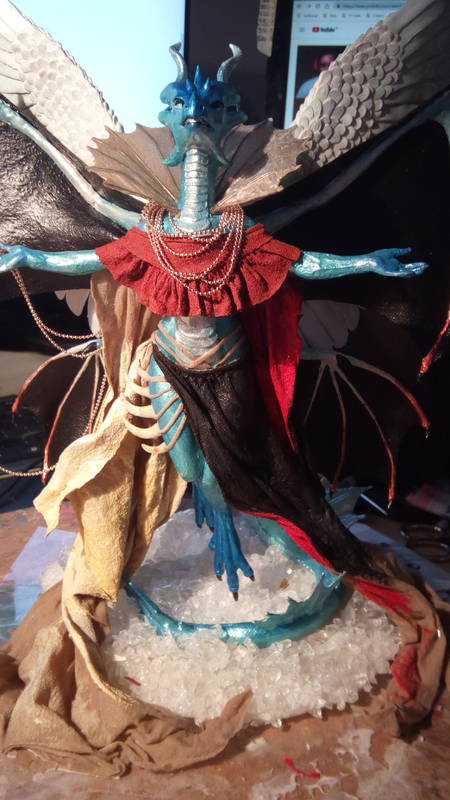
Color testing. Liked the red/black one. Didn't fit her concept at all though
As is it looks absolutely chaotic and terrible. The core of the problem was taht there was alredy plenty colors on her so finding another color that would fit well was not easy. I should have stuck to the original concept of one color for the entire body and wings.
 04.07.2019
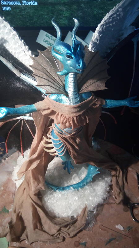
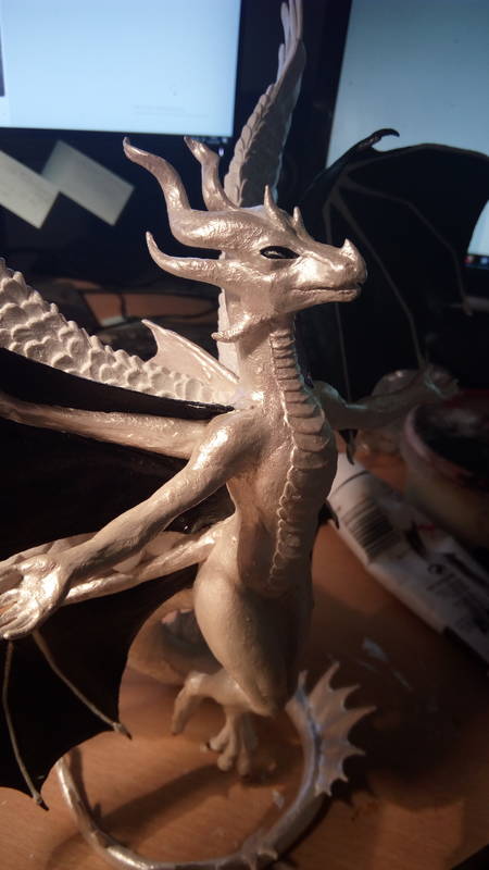
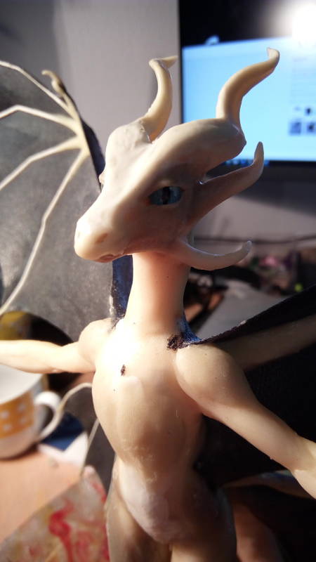
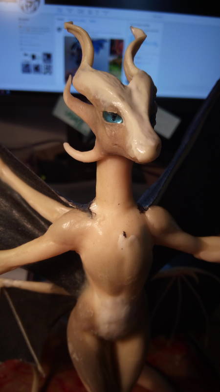
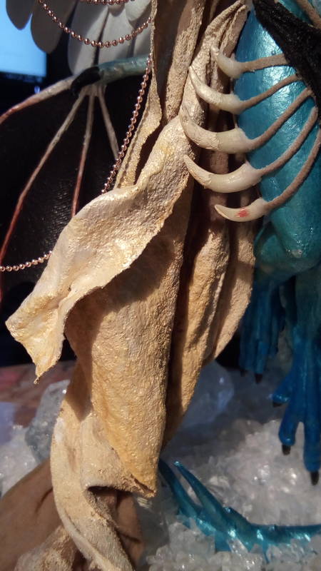
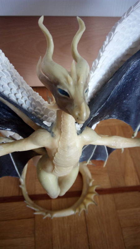
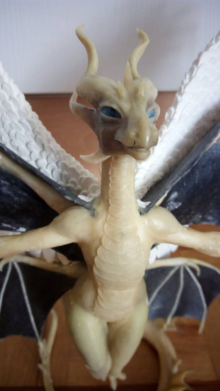
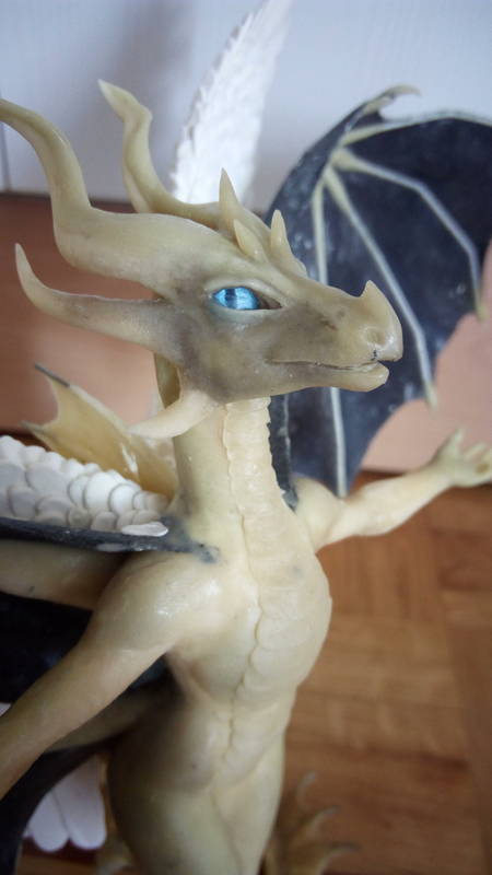
so @Akulatraxas said her face looked too dead and bland. I was inclined to agree. Now fixed
Sometimes you need some feedback to really see certain things. Her expression wasn't really even there. especially not something divine. just kinda dead eyed. So I tried to geep to something royal looking and refined her expression some. a lot more angular and serious looking now :)
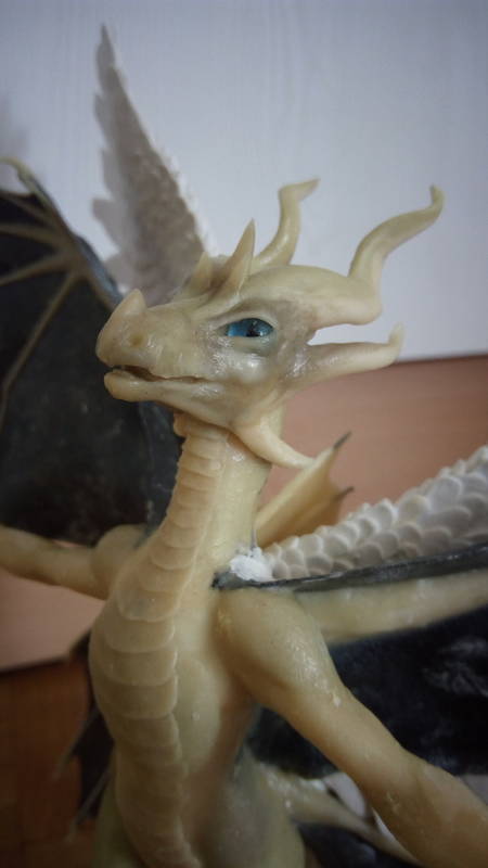
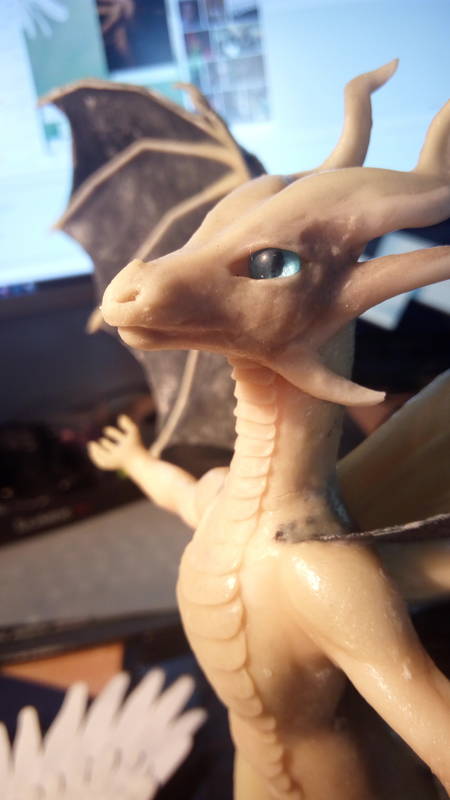 04.07.2019
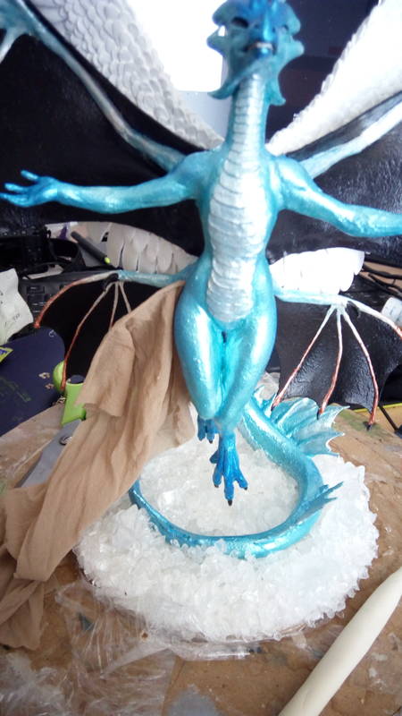
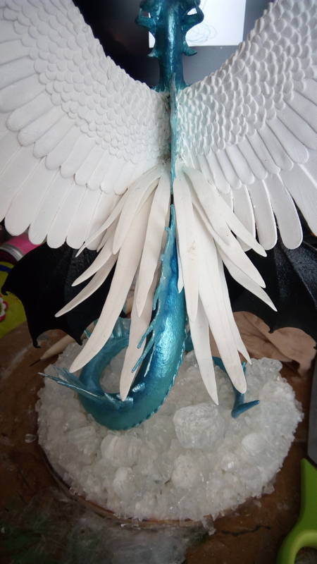
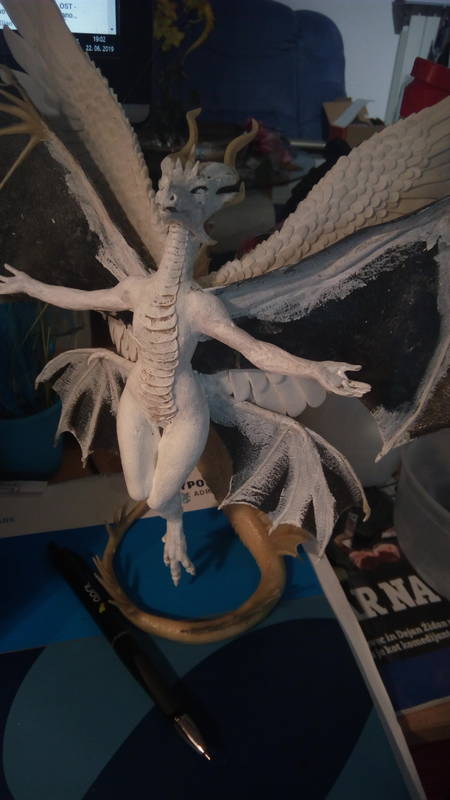
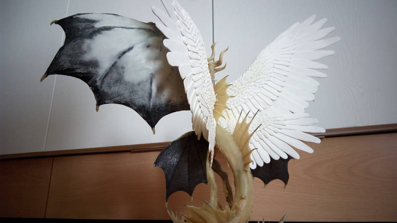
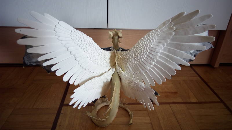
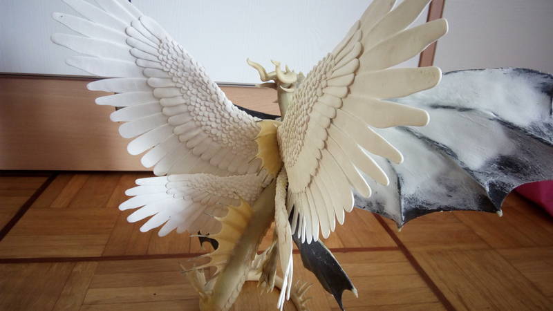
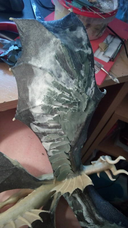
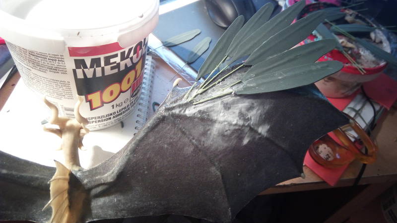
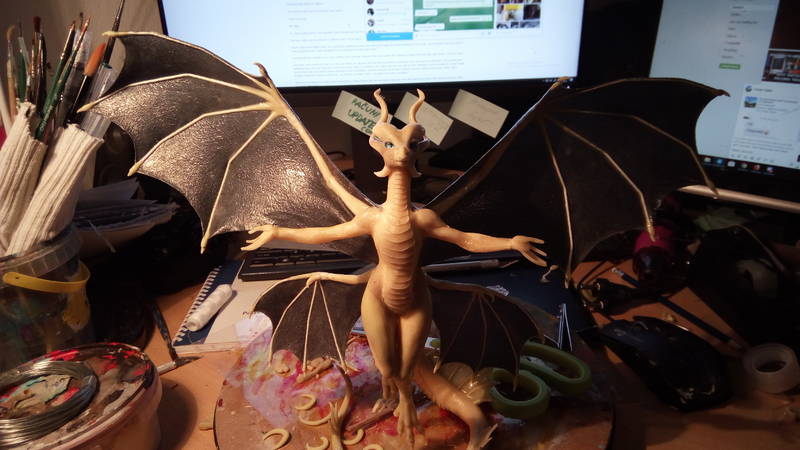
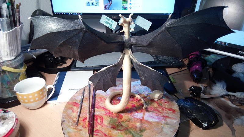
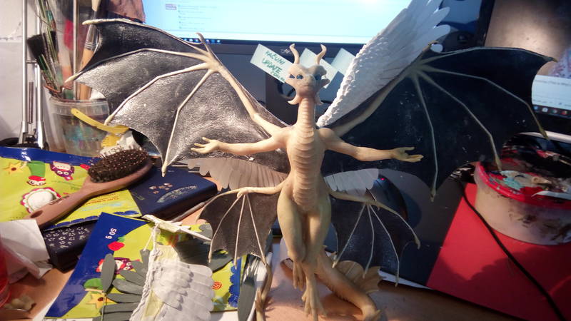
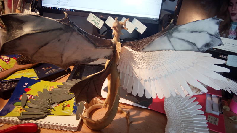
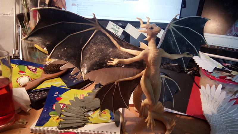
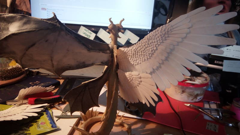
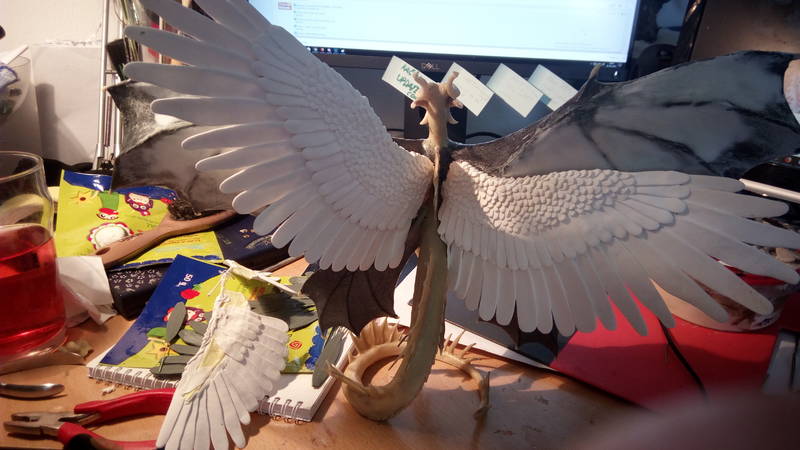
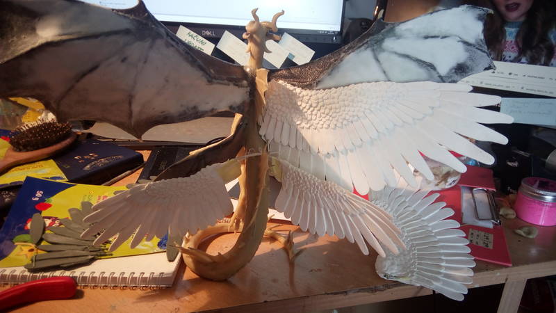
testing some wing posittions to see how it works out
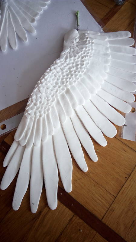
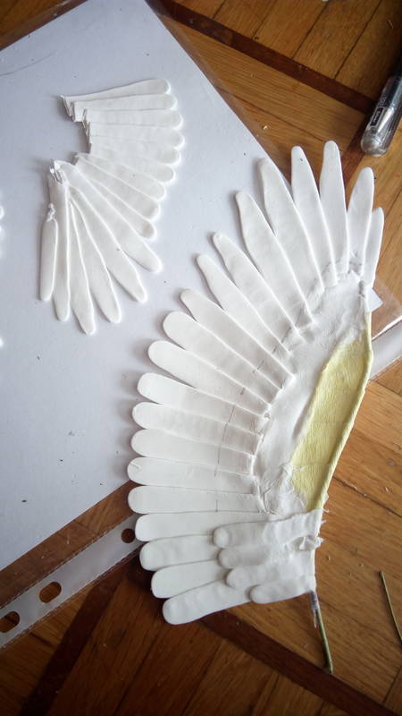
So much work invested in to making aditional sets of wings only to realise that it's far more trickier to implement them without making the whole thing look awkward. trying trying and rethinking how much of the aesthetics to sacrifice to keep all of them...
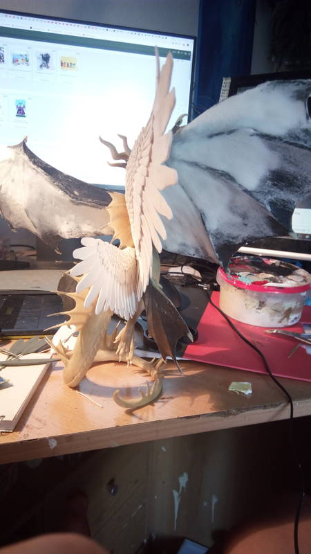
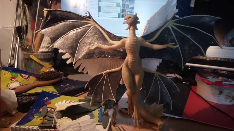
 04.07.2019
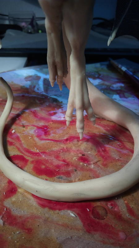
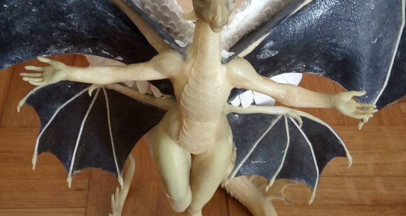
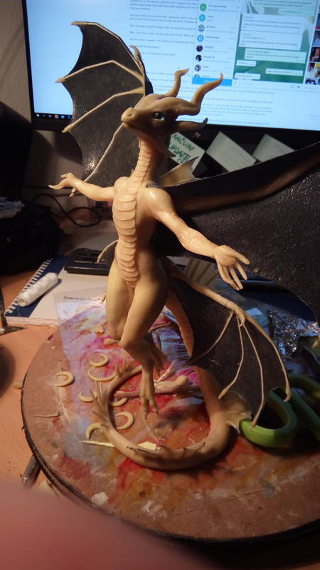
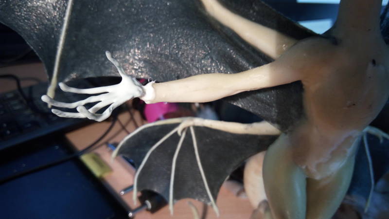
those hands just didn't want to work for me. 3 re-do's before it was acceptable
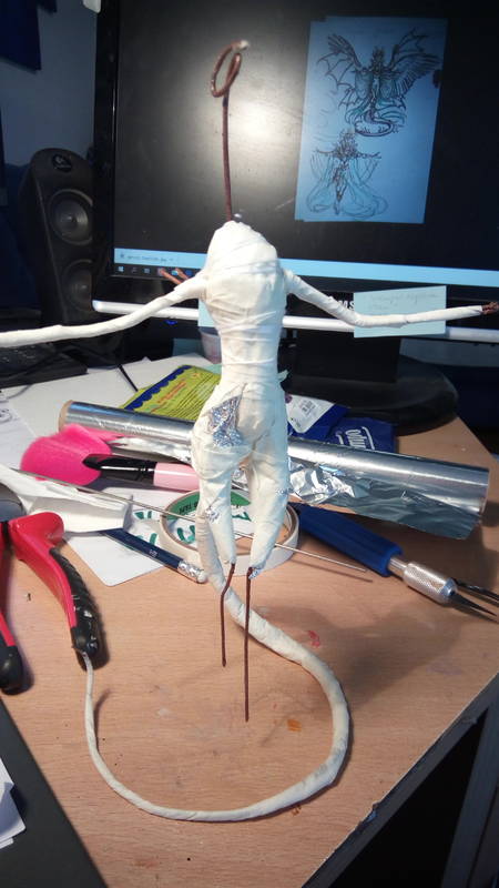
so many things went wrong. 2 with wire cores, one too large the other just fell appart, one clay hands I used was too pendy and just would stay put and then finally the fourth pair were the ones I used. Finally! XD
 04.07.2019
